


Unit 1: Redefining World Society and Culture
Lesson B: Division and Diffusion — World Belief Systems
Activity 4: Using Graphs and Charts
Historians often put historical data into graphs and charts to help us understand it better. In the last activity, you examined how to use a timeline to understand historical data and information. In this activity, you will use different types of graphs and tables to better understand historical data.
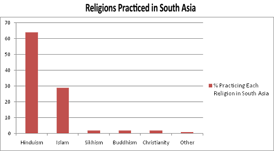
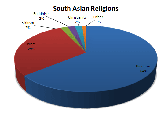
As you learned previously, Hinduism developed in South Asia. South Asia includes the countries of India, Pakistan, Bangladesh, and Sri Lanka. Take a moment to examine the graph below to see what percent of the people in South Asia practice Hinduism and other religions.
| Religions | Percentage (%) of Population Who Practice this Religion |
|---|---|
| Hinduism | 64% |
| Islam | 29% |
| Sikhism | 2% |
| Buddhism | 2% |
| Christianity | 2% |
| Other | 1% |
Tables like these help us sort through very specific information. Many times this information is in the form of numbers. In this table, we can see the exact percentages of the people of South Asia who practice each religion.
We can examine the same data in other ways. Look at the bar graph and pie chart below. These types of graphs help us better compare information to other information. Some people are more visual than others and find these types of charts and graphs more helpful than a table.
[1]
[1]

Written Activity - Notebook
In your notebook, respond to the following questions:
- Besides Hinduism, which other religions are practiced in South Asia?
- Of these religions, which ones developed outside of South Asia? (Think back to Activity 1.)
- Which of the three types of visuals (bar graph, pie chart, table) do you prefer to use to examine historical data? Why do you think you prefer this visual?
Page Notes:
[1] Source: Both the chart and pie graph were created using information available in the public domain.
