Unit 1: Redefining World Society and Culture
Lesson B: Division and Diffusion — World Belief Systems
Activity 5: Comparing Maps, Charts, and Graphs
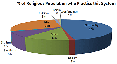
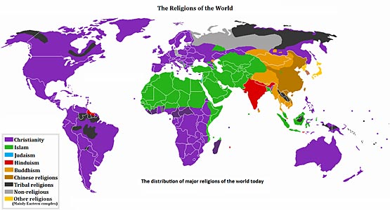
In addition to tables, graphs, and charts, historical data is often put on maps. These maps can be extremely helpful in trying to understand specific things about people in the past or present. At the beginning of this lesson, you looked at a pie chart and map. Let us look at these two visuals again and see how they each present historical data.

Note: Percentages are Rounded to the Closest Whole Number[1]

Distribution of World Religions [2]
The pie chart allows us to see how the whole world population is broken down by religion. This is important information to see and understand. However, it would be very hard to use a pie chart to be able to visually see where these religions and belief systems are distributed around the world. On the map, we can see what the majority religion is in each region. This is helpful in getting an overall idea of religious distribution around the world, but we are not able to see other common religions in each region.
Written Activity - Notebook
In your notebook, respond to the following questions:
- Which world religion is practiced by the largest percentage of the world's population?
- Name at least one region, continent, or country where this religion is practiced.
- Which world religion is practiced by the second largest percentage of the world population?
- Name at least one region, continent, or country where this religion is practiced.
- Explain why you had to use both the pie chart and the map to answer these questions.
Page Notes:
[1] Source: This pie chart was created based on information in the public domain.
[2] Source: This image from http://commons.wikimedia.org/wiki/File:Religion_distribution.png is in the public domain.

